What does the BeyondWheels logo represent?
- beyondwheels0
- Dec 30, 2025
- 1 min read

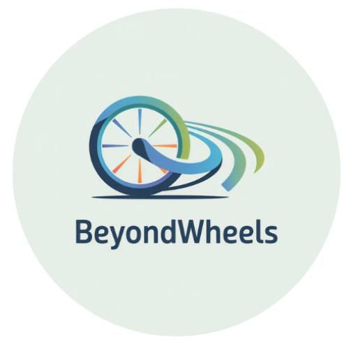
The BeyondWheels logo visually expresses the core values of the project: mobility, autonomy, inclusion and employability for adults with motor disabilities.
At its centre is the wheel. It makes motor disability visible without reducing the person to their condition. This is not a static wheel, but a wheel in motion, symbolising active participation, decision-making and the construction of future-oriented life projects.
The dynamic lines extending from the wheel represent movement, continuity and progress. They reflect the personal and professional pathways supported by the project: learning processes, skills development and access to employment or self-employment. These lines also convey one of BeyondWheels’ key principles: support without dependency.
The soft, rounded shapes reinforce a sense of accessibility, inclusion and respect, deliberately moving away from rigid or medicalised visual language. The logo communicates a vision of disability grounded in dignity, autonomy and equal opportunities.
The colour palette, combining blues, greens and warm accents, evokes trust, growth and activation. Blue reflects professionalism and the European dimension of the project; green symbolises development and future pathways; warm tones add energy and dynamism linked to employability and personal empowerment.
Together, these elements express the essence of BeyondWheels: going beyond limitation and focusing on potential.


Comments